[No Picture]
This was a pretty cool project too, but I think doing just one op art project would be okay! It was cool how the waves looked and the different patterns of colors were very interesting. I just wish I picked different colors because the ones I picked Larry already used and didn't look very good! Please get better Crayola markers next time!!! Those ones work best and look better, until they run out. This project was very cool to do and I enjoyed it but not so much the coloring part because coloring is not my strong spot... Overall, it was a pretty good project and I think mine looked ok.
Wednesday, June 6, 2012
Watercolor Project
[No Picture]
This project was really hard to do and I did Not do a very good job. ): I wish I took my time and could redo it but oh well! It was cool the way it looked, the paint, and it was very difficult trying to get the right colors and blend the colors. It was fun to make though, except when Chris spilled my water all over it so that kind of ruined it ... But overall it was a cool project!
This project was really hard to do and I did Not do a very good job. ): I wish I took my time and could redo it but oh well! It was cool the way it looked, the paint, and it was very difficult trying to get the right colors and blend the colors. It was fun to make though, except when Chris spilled my water all over it so that kind of ruined it ... But overall it was a cool project!
Tuesday, June 5, 2012
Pop Art
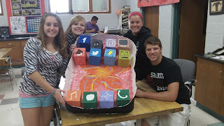
The pop art project was a very good idea and I think our's was really cool! We could have finished it and made it better, like put the button on it and the earpiece, but we got distracted by other work... The apps looked Really good and it was a good idea for us to make them 3D and have them stick out. Overall, it was a fun project and I got to do it with my friends which made it more fun!
Op Art
This project seemed really difficult at the beginning but then once I tried it was easier! It was very easy actually to create, just make a bunch of concentric circles and make a design going into it. For mine I chose lightning to be coming out of it because I love lightning bolts a lot, they look really cool. So overall I liked it a lot and it was very interesting to look at and create.
Magazine Reflection
I really liked doing this magazine reflection project because it was so interesting and challenging at the same time and really challenged our art skills! My magazine page that I chose was very colorful and had a lot to it which made it hard, and I think I did a really good job at it and made it look very good. It was very fun to do and I chose this ad because I wanted to challenge myself and my art skills and it ended up looking very good, much better than I imagined. The whole idea of it is very artistic and awesome!
Skeleton Of Minnie
I liked this project a lot and I worked really hard to make my Minnie look like the real Minnie! I don't think her skeleton is very spot on but I think she looks great! The drawing of it was really cool but not so much the coloring because it was very hard to do. This was a fun project and I enjoyed doing it. (:
Subscribe to:
Comments (Atom)


